Creating Visuals That People Remember
In today’s digital world, people scroll through thousands of visuals every single day. Most of them are forgotten within seconds. The challenge is no longer just creating something “good-looking” — it’s creating visuals that leave an impression.
Memorable design is not accidental. It’s intentional.
The visuals people remember usually combine emotion, clarity, identity, and strong visual direction into one cohesive experience.
Attention Comes First
Before a design can be remembered, it has to capture attention.
Strong visuals immediately create curiosity through:
* Bold composition
* Clear focal points
* Unique typography
* Contrast
* Emotion
* Simplicity
People decide within seconds whether something is worth looking at. If the visual feels confusing or generic, they move on instantly.
The first goal of design is to stop the scroll.
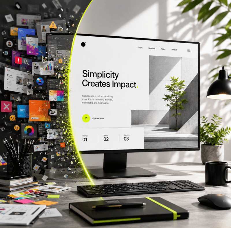
Simplicity Makes Design More Memorable
One of the biggest mistakes designers make is trying to include too much.
When a visual is overloaded with effects, colors, or information, people struggle to remember anything from it. Simplicity creates clarity, and clarity improves memory.
The most memorable visuals usually focus on:
* One strong message
* One clear emotion
* One dominant visual idea
Strong design is often less about adding elements and more about removing distractions.
Emotion Creates Connection
People remember how something made them feel more than how it looked.
That’s why emotional design is powerful.
A visual can feel:
* Energetic
* Elegant
* Luxury-focused
* Nostalgic
* Futuristic
* Calm
* Aggressive
* Premium
The colors, typography, imagery, and layout all work together to create emotional impact.
When visuals create emotion, they become easier to remember.
Strong Branding Builds Recognition
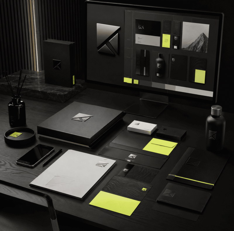
Consistency is one of the biggest reasons certain visuals stay in people’s minds.
Brands that use consistent:
* Typography
* Colors
* Composition styles
* Graphic systems
* Photography direction
become instantly recognizable over time.
Memorable design is rarely random. It’s part of a larger visual identity system.
When every piece of content feels connected, audiences begin to recognize the brand without even seeing the logo.
Typography Plays A Huge Role
Typography is often the difference between average design and memorable design.
A strong type treatment can completely transform a simple layout. The way text is styled, spaced, and positioned affects how people emotionally respond to the visual.
Great typography creates:
* Hierarchy
* Rhythm
* Personality
* Mood
* Readability
In many modern designs, typography itself becomes the hero element.
Originality Matters More Than Trends
Trends can attract short-term attention, but originality creates long-term recognition.
Designs that simply copy popular styles often disappear into the crowd. Memorable visuals usually have something distinctive about them:
* A unique layout
* Unexpected composition
* Creative concept
* Strong visual voice
* Personal style
People remember work that feels authentic.
Great Visuals Tell A Story
The best visuals communicate something instantly.
Even without reading every word, viewers should understand the mood, energy, or purpose behind the design. Strong visuals guide the eye naturally and create a narrative through composition and hierarchy.
Design is visual storytelling.
And the designs people remember are the ones that communicate clearly without needing explanation.
Final Thoughts
Creating memorable visuals is not about using the most effects or following every trend. It’s about creating intentional work that captures attention, communicates clearly, and creates emotional connection.
The strongest visuals are usually the ones that feel simple, confident, and authentic.
Because people may forget information.
But they rarely forget how a visual made them feel.